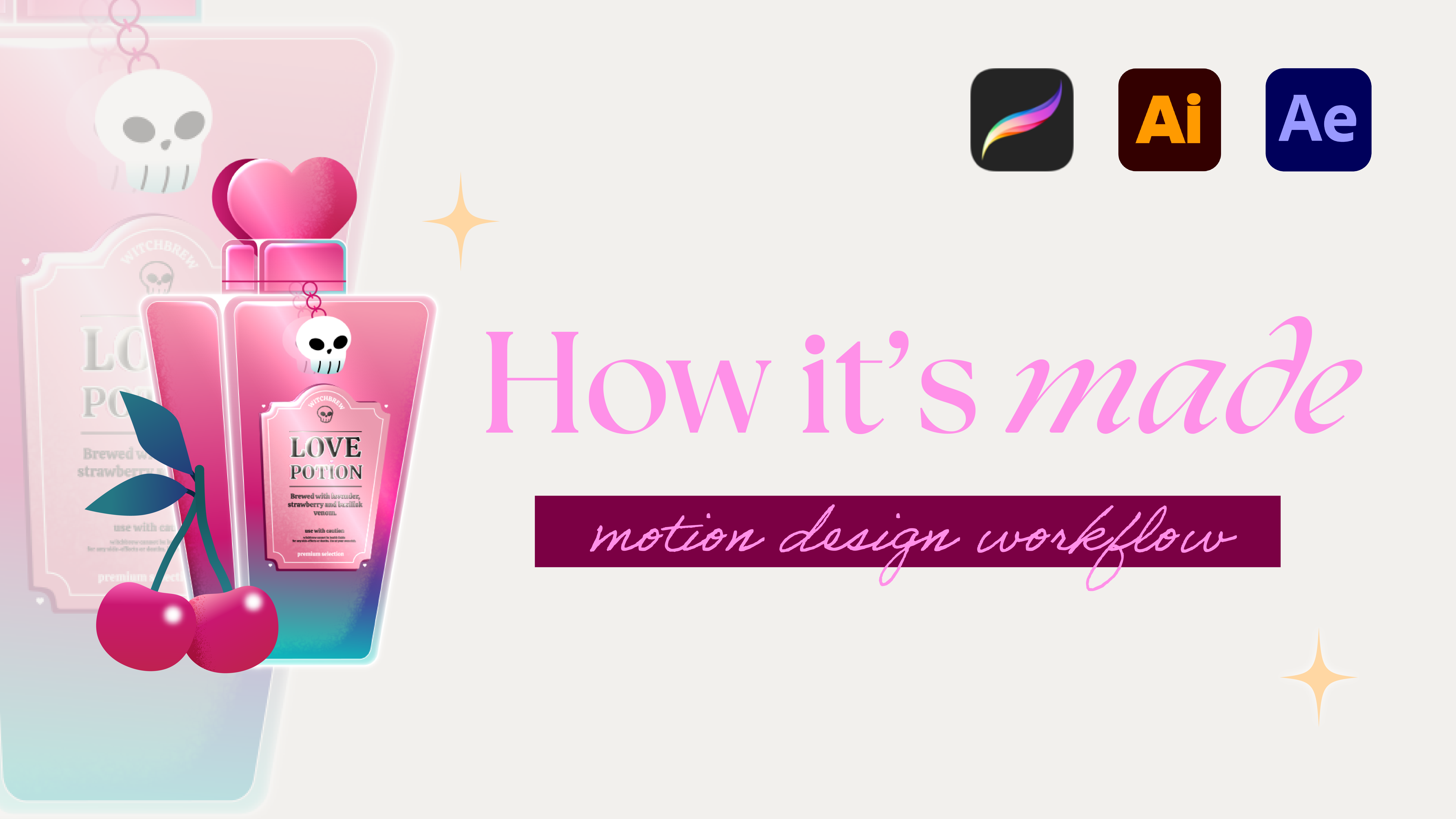
Ever had a client come back wanting a different screen size? Yep, that's a nightmare! You either need to redraw the whole thing or make a weird crop of your original image... ew. Nah, we don't want that.
Luckily, there is an easy hack to prevent you from going crazy with all these different sizes in the industry.
Short answer: it's a 1920x1920 template.
Why 1920x1920
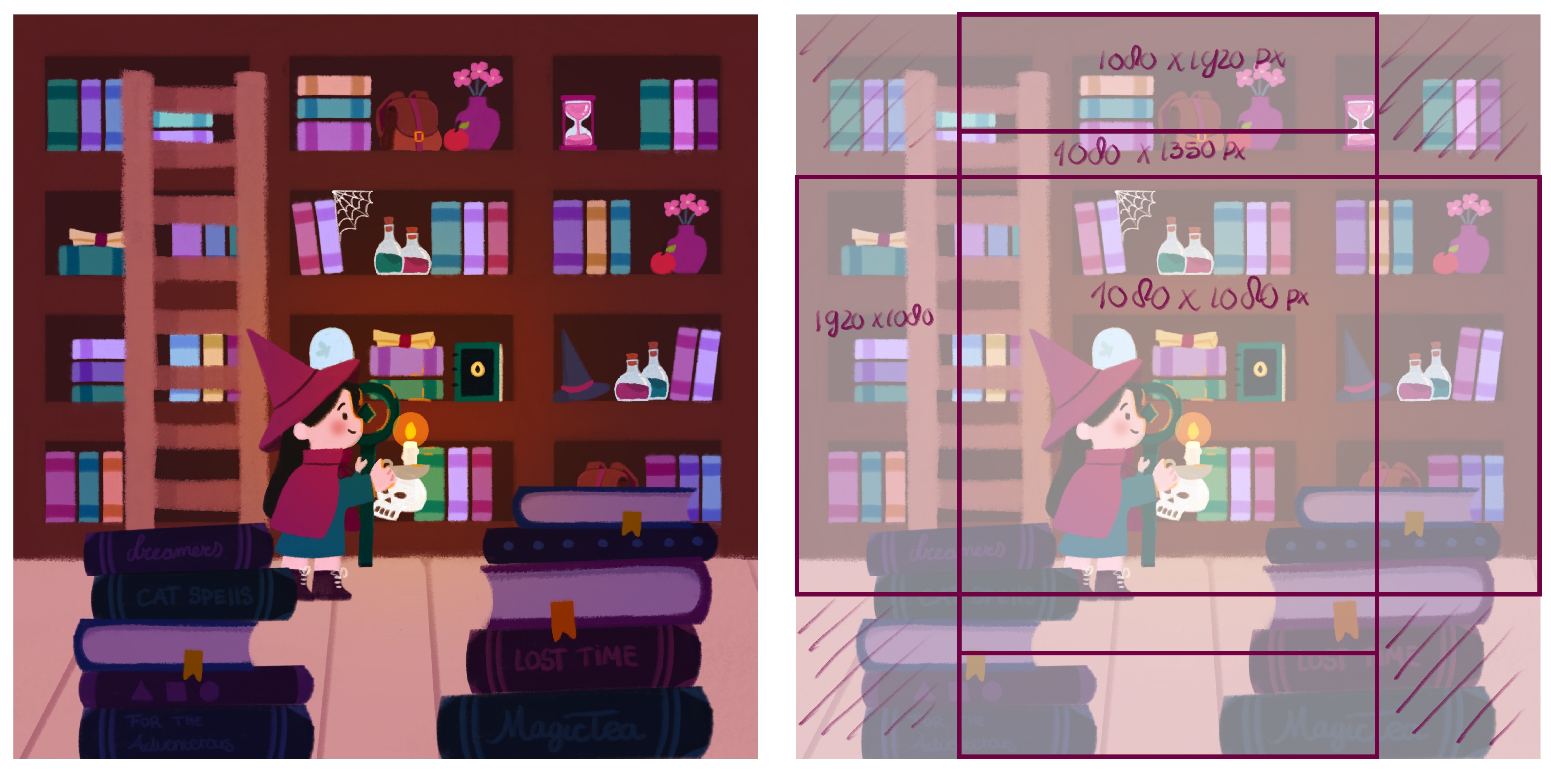
Here’s the trick: grab the two largest screen sizes you’ll need and create one square template that fits them both. But does it really matter? Why not design in 1920×1080 for landscape and crop the 1080×1920 for vertical out of that one? Let me show you the difference:
Using the crop technique
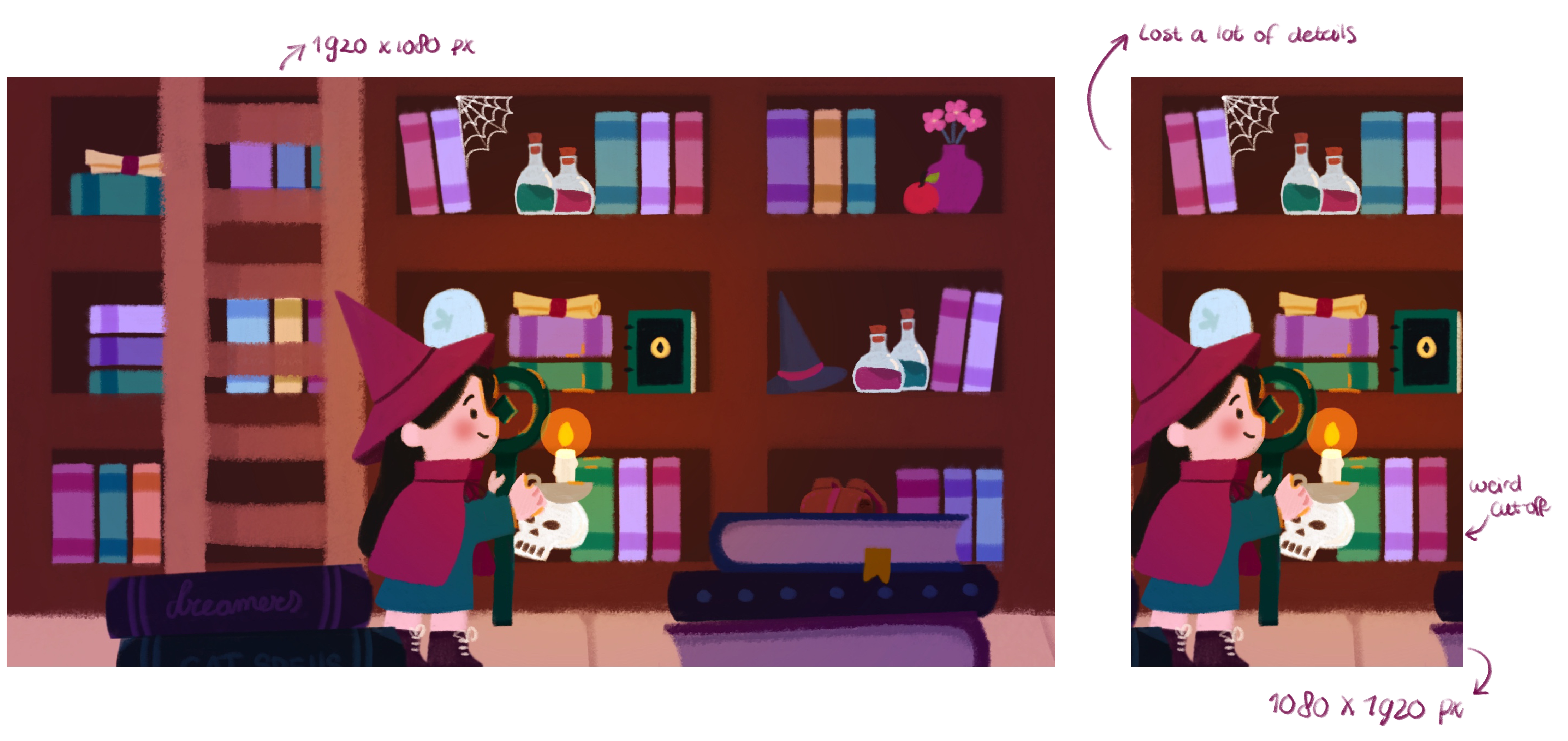
See how much of the illustration gets lost? All the hard work you put into composition, placement, and storytelling disappears. Cropping kills the narrative.
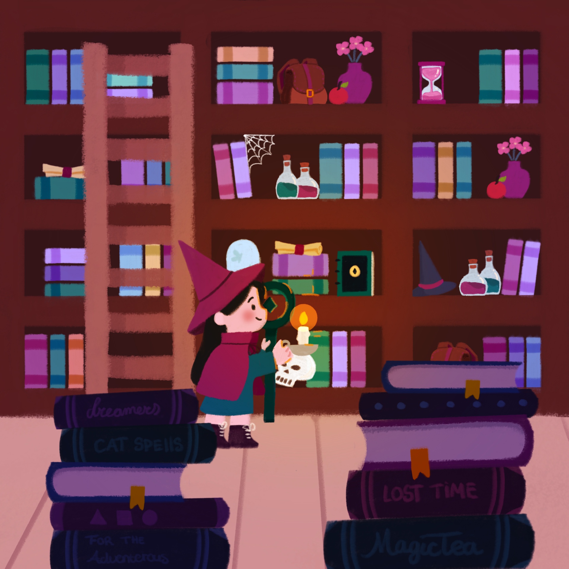
Using the 1920x1920 template
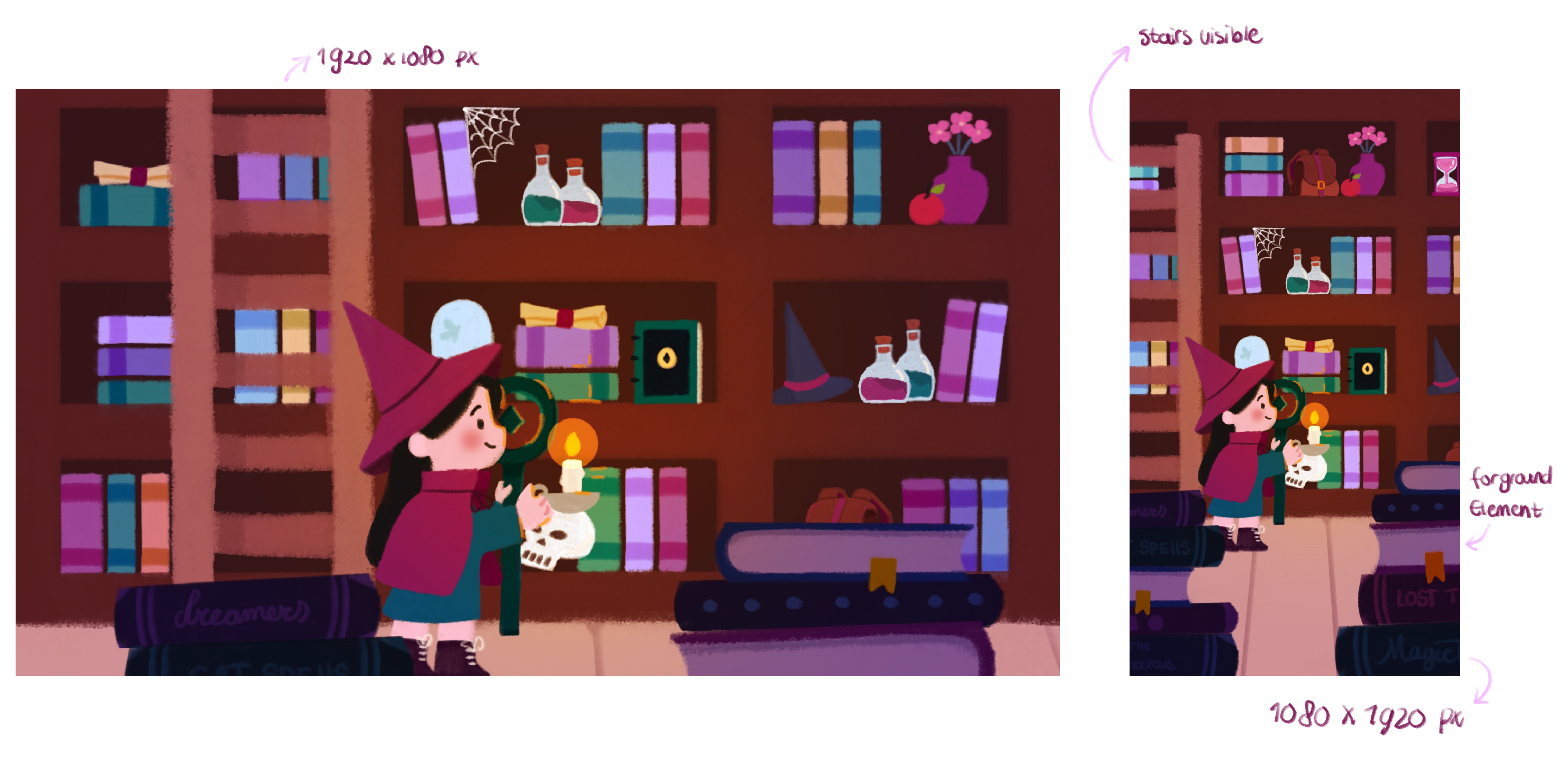
All your content stays within the same frame. Bonus: it’s perfect for animation! You can move the background a bit, experiment with following the character, or have the camera pan from top to bottom. That gives so much more freedom and flexibility.
Layers are your friend
I know you already know layers are important for organization, but they’re also a lifesaver for working less hard.
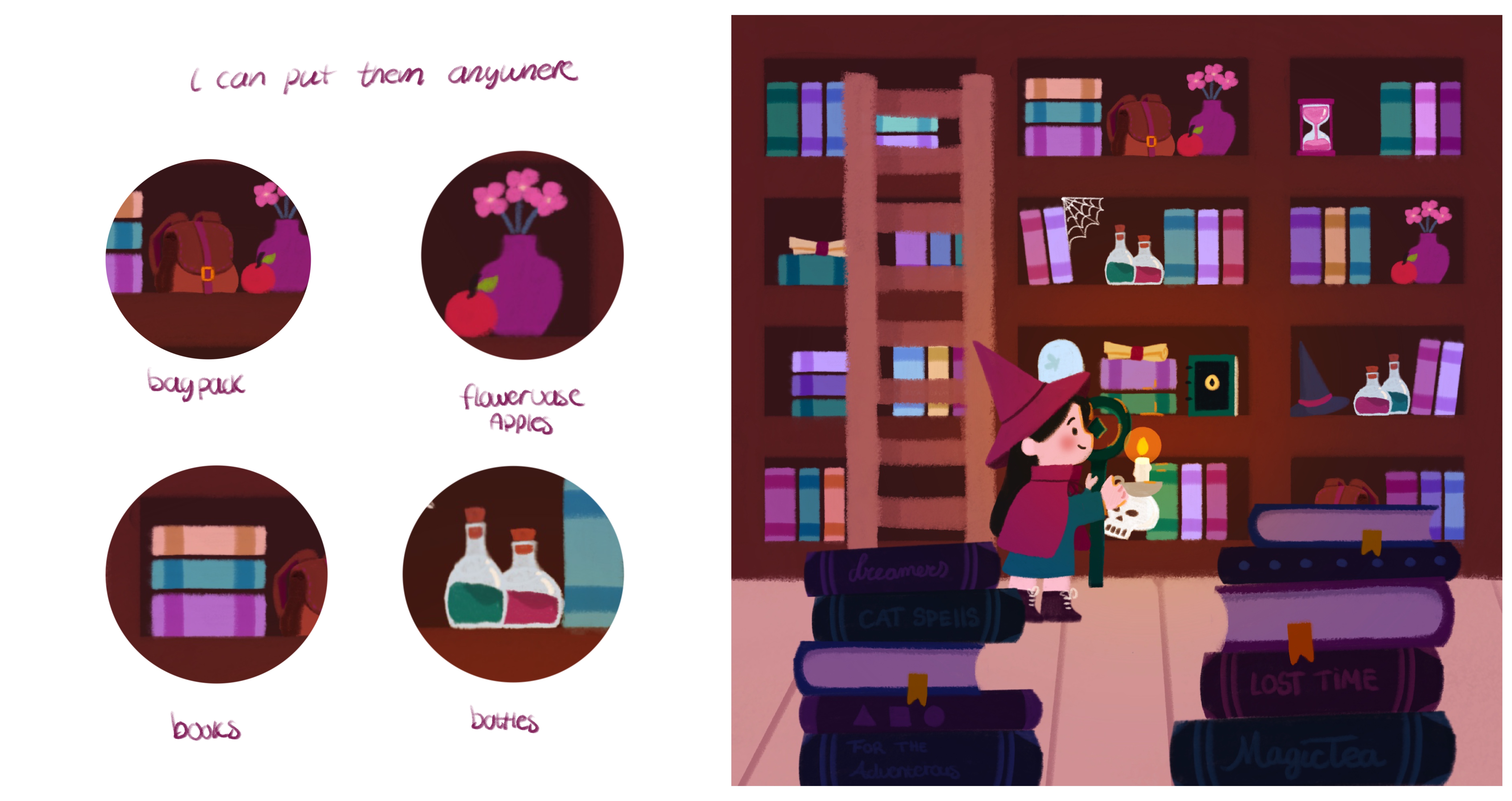
In this illustration, I didn’t draw a lot of new items for each screen. Instead, I re-used elements:
- The flower vase appears on multiple screens but in different spots.
- Empty areas? I copy-pasted existing elements.
- Books are all copied and resized.
This saves time and keeps your composition consistent across different formats.
Planning and workflow
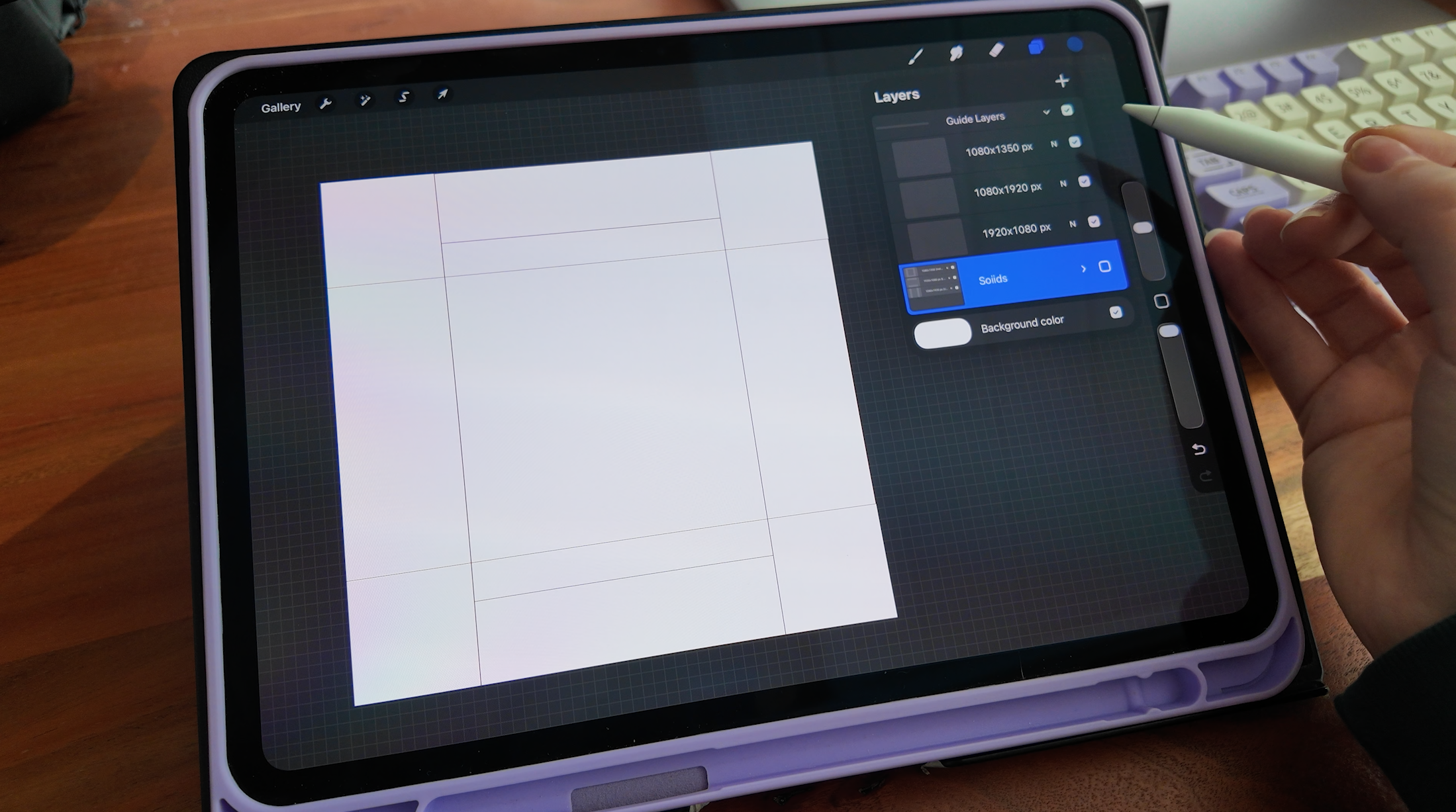
At first, it can be tricky to figure out what works for all screen sizes in a single image. My tip: create layers for each screen layout.
- Block out each screen size in its own layer.
- Toggle them on and off while working.
- Instantly see what works and what doesn’t.
No guesswork.
Extra tips
- Keep your focal points in the center (the square in the middle): your main subject should always fit within the smallest screen size.
- Re-use elements smartly: flowers, furniture, or background props can be shifted around instead of redrawn.
- Animating? Think about motion early: if you plan to animate, consider how the elements could move or pan across different sizes.
Using a 1920×1920 template might seem weird at first, but once you get the hang of it, you’ll save hours and preserve the storytelling in your illustrations!
Free Downloadable!
Get the free 1920x1920 template here or the animation files for this project here
You can find all my downloadbles here: click this link!
Enjoy!


